Thanh Thao
T
Swift Bite
Swift Bite is a service that provides and delivers organic food and ready-to-cook ingredients. The brand is committed to offering nutritious meals made from locally sourced ingredients, delivered quickly and reliably. Swift Bite targets modern, busy individuals and families who value health and convenience in their daily lives. It presents a smart, wholesome alternative to traditional fast food.
Scope of Work
-
Logo Design
-
Visual Brand Identity
Year
2025

Design
The core objective of this project was to highlight the organic nature of the products and the brand’s exceptional delivery speed. Swift Bite aims to project a modern, fresh, friendly, and welcoming image—creating an emotional connection with users across all platforms. The brand mark was developed based on three key elements:
-
The letter "S" combined with a swift bird: representing speed and reliability in delivery services.
-
Connected curves: symbolizing flow and movement, while forming a circle—a universal symbol of health and sustainability. This reflects one of the core values of organic products and Swift Bite’s long-term development commitment.
-
Half-circle shape: inspired by cross-sections of vegetables, evoking the image of meal preparation.


Color Palette
The color palette uses teal—a blend of green and blue—as the primary brand color, combined with natural tones to convey a sense of warmth and friendliness while maintaining a modern and tech-forward impression.
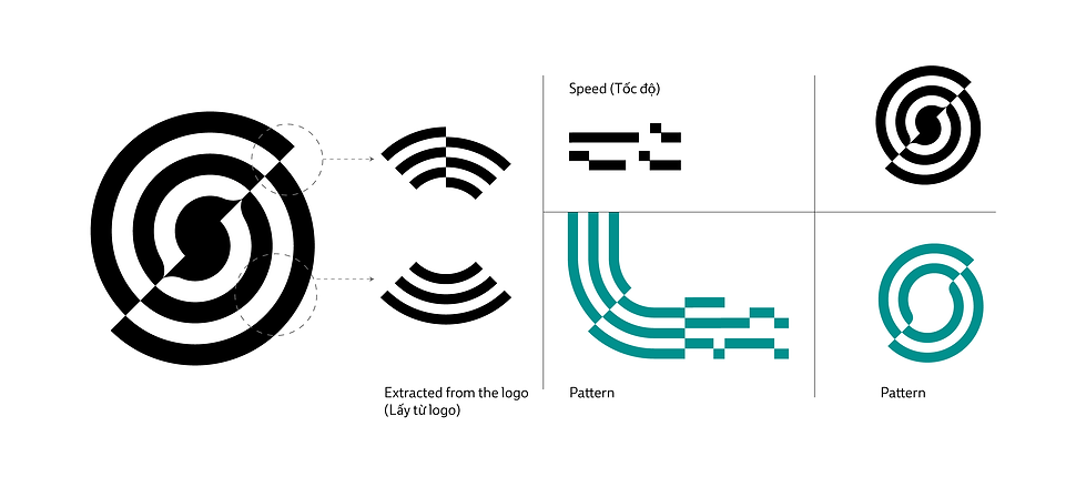
Pattern
The pattern system is derived from elements within the logo, enhanced with visual cues of speed to create a unique and recognizable identity.


Typography
The combination of organic food and delivery speed is the core philosophy that defines the Swift Bite brand. Based on this, I aimed to design a modern, geometric logo paired with a humanist sans-serif typeface to convey user-friendliness. The chosen font, Ebony, features bold and smooth curves that evoke a sense of dynamism and speed. This harmony between the logo and typography brings balance and coherence to the brand identity.