Thanh Thao
T
VITA 10th anniversary
To celebrate 10 years of growth, VITA Clinic launched a branding campaign with the concept "VITA — A Decade of Shaping Precious Stones" centered around the idea that every woman is like a precious gem—becoming more radiant with time. The campaign highlights the clinic’s commitment to enhancing both outer beauty and inner confidence. This campaign not only celebrated a milestone but also strengthened VITA’s emotional connection with its customers.
I was responsible for the visual identity of the campaign, including logo design, custom icons, and various digital assets such as banner ads, e-gift cards, and social media posts.
Scope of Work
-
Art Direction
-
Visual Identity
-
Digital Assets
Clients
VITAClinic
Year
2024

Concept
As people age, the signs of time naturally begin to show—but with proper care, each person can maintain their unique beauty through every stage of life. With the theme “VITA — A Decade of Shaping Precious Stones,” the campaign delivers a meaningful message: women continue to shine like precious gems when they invest in themselves. Just as raw stones are refined over time to reveal their brilliance, every VITA customer is treated as a gem—cared for and polished to bring out their most radiant, confident self.


Design
The designs reflect elegance, femininity, and the refined beauty that comes with experience—echoing the core message of the brand.
Logo Design
The anniversary logo was developed using a grid inspired by the faceted cuts of gemstones, symbolizing the idea of polishing and shaping over time.
Typography
Chakra Petch was selected for titles and headings due to its angled edges that echo gemstone facets. It was paired with Montserrat, VITA’s primary brand font, for body text to maintain visual consistency.


Color Palette
The logo color—Emerald Green—was chosen from VITA’s brand identity, enhanced with gradients and gemstone-inspired light reflections.
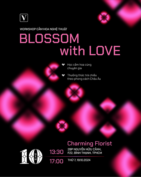
Custom Icons
The icons were developed based on the theme of each event (e.g., a gift box for promotions, flowers for Women’s Day, a scale for health checkups,...). Each icon was stylized to resemble the way light reflects off the surface of a polished gemstone.

Grid system
All designs were built on a 45° rotated square grid system, ensuring alignment, harmony, and consistency across platforms.